Video 1- In the video they make the models neck longer. Also the give her more hair and make her skinnier. Also they make her brighter and make her eyes and lips bigger. Also a ton of makeup.
Video 2- The second video they make her legs longer, they make her skinnier, and make her lighter. Also they put on a ton of makeup and made her feet smaller. Also the made her nose smaller and gave her bigger eyes and lips and more hair.
Video 3- They added a lot more hair and made her about a hundred pounds more skinny.
4. I think it is wrong to change a persons whole appearance just for marketing purposes. Not only does it make other women feel unsecured about what they look like compared to the model it could also make the model feel bad knowing she doesn't really look like how she wants.
5. In my opinion I think under no circumstances they should change someones appearance that much.
6. I think no edits should be changed but makeup and hair extensions are fine.
7. I think fashion photography is to make someone look appealing by changing what they loo like, and photojournalism is getting the beauty out of things without changing anything.
8. I think all photography has photoshop, but I feel it is used to much.
9. I think you showed us these videos make us realize while photoshop is good you shouldn't use to much of it.
10. I don't know why known of these are about guys, but maybe they were advertising makeup and the majority buyers are women.
Monday, November 24, 2014
Thursday, November 20, 2014
Magazines Part 2
- Early magazine Covers- Early magazine covers usually did not have a cover photo and usually was just a table contents as the cover and would explain what each section will be about.
- The poster cover- The poster cover was not many words on the cover and was usually just a picture about what the magazine would be about.
- Pictures Married to type - These type of covers were usually a title with a model covering a part of the title to add an effect to want to read and look at it.
- In the forest of words- These type of photos usually have a picture surrounded by words to explain what each section will be about. These covers are used most commonly in the modern era.
Favorite Cover
The magazine cover I chose was called "Germs" and it shows a baby in a photo sitting on grass and a dog coming up to the baby and licking his face. I think this photo was used because the photo is trying to inform about germs and it shows a dog licking the babies face. I like how the cover fits the whole page and the background is a different color making it more interesting to look at. Also the lighting is at a good level and everything in balanced because of the baby on one side and the dog on the other side of the magazine cover in this photo.
Magazine Covers Blog 2
Best Covers…
1. Informal
2. Informal
3. Enviromental
4. Informal
5. Formal
6. Formal
7. Informal
8. Formal
9. Formal
10. Informal
11. Formal
12. Formal
13. Formal
14. Formal
15. Informal
16. Informal
17. Informal
1. Informal
2. Informal
3. Enviromental
4. Informal
5. Formal
6. Formal
7. Informal
8. Formal
9. Formal
10. Informal
11. Formal
12. Formal
13. Formal
14. Formal
15. Informal
16. Informal
17. Informal
Magazine Cover
Five Tips Blog 1
1. cover background pops out
2. don't make main subject and background the same color
3. do not trim image
4. Use full color
5. Overlap images
1. cover background pops out
2. don't make main subject and background the same color
3. do not trim image
4. Use full color
5. Overlap images
Wednesday, November 12, 2014
American Soldier
I think the most powerful image in the slideshow is one of the most simplest photos that was taken during the slideshow. I think it was the photo of Ian sleeping in his full gear. This one is important because this shows how people in the army are always at work.
The photos taken in Denver were from photos 1 through 9.
The photos of basic training are from 9 through 51
The photos of Ian in Iraq are from photos 51 to 76
The photos of Ian back in Denver are photos from 76 to 82
I think the photos for training were the most powerful, because Ian had to prepare very hard.
The images told a story on how Ian worked and struggled but finally did it.
Usually when the photo is about Ian the caption is almost like someone is telling about Ian and are in present tense.
The captions and how they are written make you feel like you know him.
Photo # 65- Ian sleeps in his full uniform ready to leave for a mission whenever he is called.
Photo # 12- Ian got his hair shaved for the army, while the other soldiers waited in line.
Photo #76- Ian's dad waits to be reunited with his son as the troops come home.
Monday, November 3, 2014
Portraits
Quotes
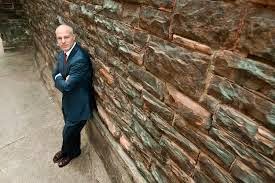
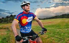
The casual portraits above are simple yet interesting. The man against the wall is casual but the wall leads to him. The man on the bike is simple but the tree line in the back leads to him.
I will be taking these photos at my house. They will be taken in my backyard where I have plenty of things to use to enhance the photo. Also I might use the front yard too. To make this shot successful I will use rules of photography. I will take my self portrait of me, obviously and my other portrait of my brother.
1. Looking within the frame – alternatively you could have your subject looking at something (or someone) within the frame. A child looking at a ball, a woman looking at her new baby, a man looking hungrily at a big plate of pasta…. When you give your subject something to look at that is inside the frame you create a second point of interest and a relationship between it and your primary subject. It also helps create ‘story’ within the image. ( Darren Rowse )
2. Experiment with Lighting
Another element of randomness that you can introduce to your portraits is the way that you light them. There are almost unlimited possibilities when it comes to using light in portraits.
Side-lighting can create mood, backlighting and silhouetting your subject to hide their features can be powerful.( Darren Rowse )
3. Get Closer
The most common mistake made by photographers is that they are not physically close enough to their subjects. In some cases this means that the center of interest—the subject—is just a speck, too small to have any impact. Even when it is big enough to be decipherable, it usually carries little meaning. Viewers can sense when a subject is small because it was supposed to be and when it's small because the photographer was too shy to get close.
Don't be shy. If you approach people in the right way, they'll usually be happy to have their picture made. It's up to you to break the ice and get them to cooperate. Joke around with them. Tell them why you want to make the picture. Practice with people you know so that you are comfortable; people can sense when you aren't. (Robert Caputo)
The portraits above are environmental portraits. These photos stand out to me because the one where the man is on the mountain is very vibrant and blue. Also the one on the right is simple but interesting to look at with the grass pointing to the man.

 The self portraits to the left both have interesting perspectives. The one with the girl in the mirror is interesting because it appears as if the girl has a huge hole in her. The man with the paint brush is interesting making his face more vibrant.
The portraits above are environmental portraits. These photos stand out to me because the one where the man is on the mountain is very vibrant and blue. Also the one on the right is simple but interesting to look at with the grass pointing to the man.

 The self portraits to the left both have interesting perspectives. The one with the girl in the mirror is interesting because it appears as if the girl has a huge hole in her. The man with the paint brush is interesting making his face more vibrant.
The casual portraits above are simple yet interesting. The man against the wall is casual but the wall leads to him. The man on the bike is simple but the tree line in the back leads to him.
I will be taking these photos at my house. They will be taken in my backyard where I have plenty of things to use to enhance the photo. Also I might use the front yard too. To make this shot successful I will use rules of photography. I will take my self portrait of me, obviously and my other portrait of my brother.
Subscribe to:
Comments (Atom)


